Is the next big crisis here? Let’s look at the market data first. Investors are suddenly paying a lot more for default insurance on corporate bonds. I’m talking about Swiss-based commodities trader Glencore, of course. As a commodities trader that didn’t see China’s trouble coming, the stock is copping a whack, as my Aussie friends would say.
At the end of last week, it would have cost you $294,000 to insure $10m worth of Glencore bonds against default in the credit default swap (CDS) market. After Wednesday’s 10% decline in Glencore’s London-listed stock price, the CDS insurance had shot up 12.25% to $330,000. Remember, it was ruction in the CDS market that alerted everyone to trouble in the US housing market. The rest, as they say, is history.
Glencore and the US housing bubble are directly related. Both were creations of low-interest rates. They created huge bubbles in US houses in the mid-2000s and commodities in the late 2000s. That’s the trouble with low interest rates by the way. As a central banker, you can lower the price of credit to bargain basement levels. But you can’t control what people spend their borrowed money on.
Glencore spent in building its commodities portfolio. It now has $31bn in debt at a time when copper and oil – two of its main commodities – are in decline. That’s a bad situation. And it’s why the credit markets – always the early warning system of financial markets – are raising the alarm.
What about the equity markets? Are there troubling signals there, too? Allow me to submit two charts for your consideration. First, the advance-decline (A/D) index on the New York Stock Exchange is ‘rolling over’/ The A/D line is a simple calculation that subtracts the number of daily decliners from the number of daily advancers on the New York Stock Exchange. Check it out below.
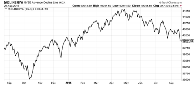
Advancers are in decline! That is, market breadth is breaking down. There are fewer stocks going up and more stocks going down on a daily basis. For a market-cap weighted index like the Dow Jones Industrials, a break-down in breadth can be obscured if one or two of the biggest stocks (by market capitalisation) are rising. Bigger stocks have a larger influence on the direction of the Dow.
But the A/D index line doesn’t lie. It shows you that stocks as an asset class are not responding well to the idea that the Federal Reserve may raise rates. For an even broader picture, check out the Wilshire 5000 below. It’s the broadest measure of US stocks. What do you reckon?
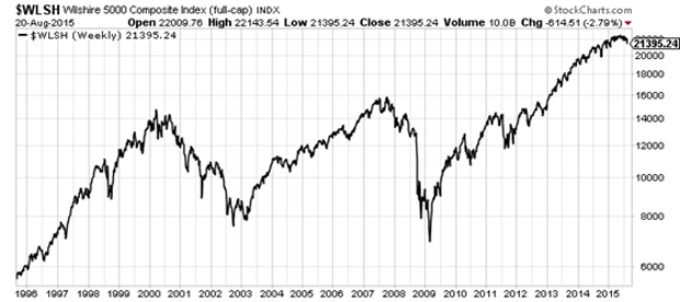
It certainly shows that stocks have been the right place to be for the last 20 years. True, 2009 would have given you some serious second thoughts, if not a heart attack. But in an era of declining interest rates and expanding debt, equities were the place to be. Are they still the place to be?
That’s a question I asked Tim Price over a spicy Szechuan lunch in Soho yesterday. It was the kind of spice, by the way, that required a beer or two to cool things down. But over the spice and suds, Tim and I reached a similar conclusion: the deflation is now.
Category: Market updates