They say a picture’s worth a thousand words.
So today I’m going to keep things short, stay quiet and let five charts do the talking. I think they prove that we’re at a vital, and profitable, point in the stock and real estate cycle.
If that’s the case, they’ll help you make much better decisions with your money over the next ten years. Let’s see if you agree.
A little background first. All five charts you’re about to see come from a presentation that Akhil Patel and Southbank Investment Research publisher Dan Denning put together. The goal of the presentation is simple: to help you understand a change taking place within the economy today that could double your entire invested wealth, if you understand it.
It’s based on an idea you may never have heard about or considered before. Akhil calls it the “Grand Cycle”. Another way of describing it would be a road map for the future of the markets.
It’s a simple but powerful idea. The stock, bond and commodity markets moves in an 18-year cycle. That consists of a 14-year uptrend and a four-year downtrend. You can further break down the 14-year expansion into two phases of seven years, with a small slowdown in the middle.
As Akhil puts it, “the start of the cycle is always marked by a major ‘generational’ low. The peak is marked by an equivalent high.”
Here’s a graphic illustration of how the cycle unfolds
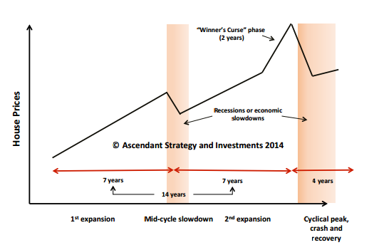
Akhil has studied this pattern going back 200 years. It’s remarkably consistent. In fact, it perfectly explains the financial crisis. In 2007/08 we were entering the four-year downtrend. Eighteen years before that in the early 90s we entered another downtrend, with the housing market in the UK correcting sharply, interest rates shooting up and many people falling into negative equity. Before that it was the crises in the mid 70s.
Based on this reading of the markets, the financial crisis was simply a manifestation of the cycle. The “generational low” came in around 2011 and a new cycle began.
Where does that put us now?
Smack bang in the middle of a 14-year uptrend. And here’s the thing: the second half of the expansion is always the most profitable part. In fact, it’s the stage of the cycle where you absolutely, positively want to be invested. You don’t want to sit on the sidelines. You don’t want to let bad news flow warp your perspective. And you want to be in the market.
Want proof? Here it is.
Let’s take a look at the 18-year cycle between 1884 and 1902. Yes, this goes back that far (and further). Here’s a chart of the UK stockmarket in that time.
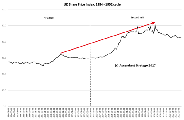
The dotted line marks the midpoint of the expansion. To the left, you see steady growth. To the right of it, the market soars (until the extreme right, when the four-year downturn hits).
Answer me this: when was the best time to be in the market?
The second half of the expansion! The market took off and almost doubled.
Let’s look at another example. Here’s the market between 1956 and 1975. Again, the dotted line marks the mid-cycle slowdown – before the second half of the expansion kicks in and drives the market on. The market more than doubled. Take a look:
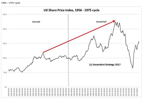
Again, ask yourself when the best time to be the in the market was. The answer is the same: the second half of the expansion period. (Notice again that the very end of the cycle involves a four-year downturn.)
Let’s look at the next cycle, between 1975 and 1992:
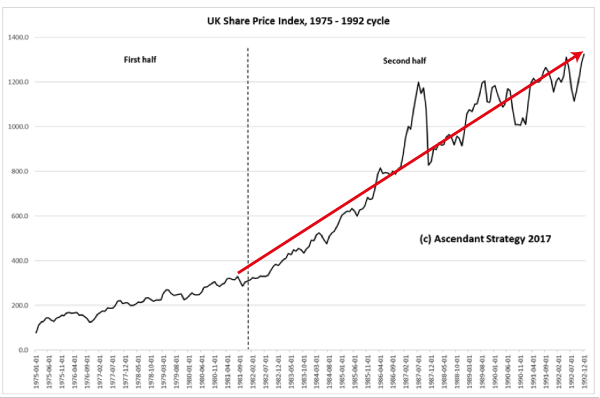
Same story. The first half of the expansion is reasonably muted. The second half is explosive. The market more than doubles. It’s the one point in the cycle you need to be invested in.
What does this tell you about today?
Well, if Akhil is right, what we’ve seen since 2011 is entirely consistent with the Grand Cycle. The markets have moved higher, though not explosively so, as this chart demonstrates.
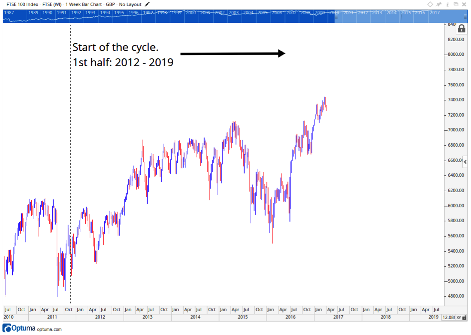
But crucially, it means we could soon be entering the high profitable second half of the expansion. The point where the stock and property market could double.
The FTSE at 15k? Is that such a crazy idea? Perhaps. Will that stop it happening? You tell me. But before you do, you need to see Akhil’s research in full.
If the market explodes higher without you, you’ll regret not at least considering his ideas.
Best,

Nick O’Connor
Associate Publisher, Capital & Conflict
Category: Economics