I am detecting a certain amount of bullishness in the housing market of late. A number of people with cash are talking about “buying later this year”, or “taking advantage of these low rates”.
A gent I met at a drinks party at the weekend was very keen on a property in Kensington because it was down from £3 million to one and a half. Foreigners, we are told, are taking advantage of the falling pound to buy prime Central London property. Viewing activity at my neighbour’s unsellable (or overpriced) house is increasing. At the recent Savills auctions, London properties in decent areas were still fetching surprisingly good prices.
There are even some at the great refuge of the bears, website housepricecrash, who are now considering buying, though well below market value.
From lower interest rates and quantitative easing to almost forcing banks to lend, the government seems to be doing everything in its power to engineer a bounce. Cynics would say it’s “just in time for the next election”.
But it’s a mistake to buy now. It’s a big, big bull trap…
Beware – we are entering a bull trap
Let’s start with one of my favourite charts, and one I’m extremely fond of posting, Dr Jean-Paul Rodrigue’s Manias and Bubbles.
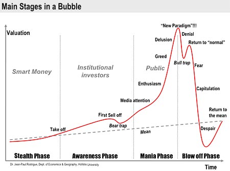
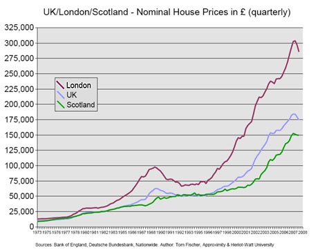
As you can see, it’s a virtual mirror of our own housing index (below).
Our housing market has played out right to the script. While there are some at Rodrigue’s ‘fear’ stage – those that need to sell, but can’t – for the most part I think it’s fair to say that Joe Public is still very much ‘in denial’ and thinks that things are about to ‘return to normal’. In other words, we are entering a bull trap – just as we did in 1991, when there was a brief rally before further declines. We are nowhere near capitulation. That is still to come.
We have, however, had capitulation, fear and goodness knows what else in the stock markets, which brings me to my next chart. I would like to thank Nick Laird of Sharelynx for putting this together for me. It shows the UK House Price to FTSE 100 ratio. In other words, how expensive houses are relative to stocks. This is one of those charts that tells a very powerful story:
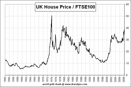
Except for a brief period in 1973, relative to stocks, UK houses are as expensive as they’ve ever been. That chart is telling you to sell houses and buy equities. It currently takes just under 40 FTSE points to buy the average UK home, a level not seen since 1980. We can expect that chart to move back to 20, or even to the longer-term mean of around 10.
But to do so we would either need a very significant and sustained rally in the stock markets, or a significant and sustained fall in house prices – or a bit of both. Guess which one I’m betting on? The stock market has returned to 1996-97 levels. Why can’t house prices?
Enjoying this article? Sign up for our free daily email, Money Morning, to receive intelligent investment advice every weekday. Sign up to Money Morning.
House prices have much further to fall
As a side note, it’s interesting to see how much more stable that ratio was in the 1950s and 60s, before the volatility of the period post-1971 to now. Could that change in pattern have anything to do with US leaving the gold standard in 1971, ushering in the modern era of almost unrestrained growth in the supply of money and credit?
Prospective buyers must realise that interest rates are being held at artificially low levels. What happens to house prices when rates are forced up, as they inevitably will be? What then? What happens to all those who are on the brink now, but just surviving? What happens to those on tracker rates, who haven’t yet felt the crunch because their monthly repayments have fallen so low? What happens to first time buyers and buy-to-let landlords in a high-interest-rate environment? That is when we get Rodrigue’s ‘capitulation’.
House prices remain out of kilter with what people earn. No matter what the government does, they will head lower until they reach a level which people can afford, which history has shown to be about three times earnings. And they will probably overshoot this to the downside because of the scale of the preceding boom and the oncoming bust. There is nothing anyone, not tycoon nor politician, can do to stop this inevitable course. All they can do is delay it.
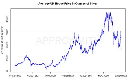
How many ounces of silver for the average UK home?
Regular readers will know that another chart I’m fond of posting, shows the ratio of the average UK House Price to Gold – in other words, how many ounces of gold it takes to buy the average UK home. Tom Fischer of Heriot-Watt University has kindly sent me the same chart, but for silver:
Here is a log version of the same chart.
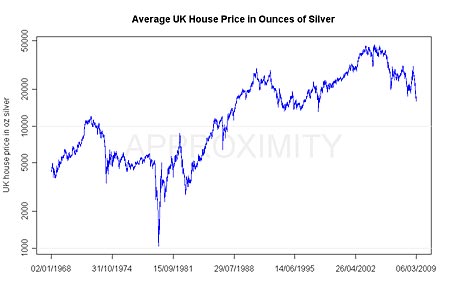
When silver spiked to $50 in 1980, you could buy the average UK house for one thousand ounces of silver. A thousand ounces of silver now costs about £10,000, while the average UK house is now about £150,000.
Looking at the above charts, a reversion to the long-term average of 5,000 ounces for the average home looks likely. But if precious metals mania sweeps the globe as the financial crisis continues, who knows? Once again we may see 1,000 ounces for the average UK home.
Category: Market updates