“The most bullish chart on the face of the planet.”
That was James Turk, author and president of online bullion dealer Goldmoney, speaking at the Gold and Silver Summit in London last week about a specific metal.
He went on. “In fact, it’s the most bullish chart I’ve ever seen on the face of the planet.”
What was he talking about? Silver.
And that’s what we’re going to look at today…
One pundit with a very solid track record
James Turk is a friend of mine, and a man I greatly admire. His book, The Coming Collapse Of The Dollar (now renamed The Collapse Of The Dollar) written with John Rubino and published in 2004, was one of the first books I read about the ‘great monetary unravelling’. It remains one of the best. It’s the first book I recommend for people who are new to gold and want to learn more.
The financial strategy it outlined has been prescient. Among other things, it recommended steady accumulation of gold and silver, month in and month out. And it said to get out of anything financial or banking related, recommending that the more speculative players should short this sector (ie bet on it to fall). What a trade that was.
There are two areas which have not quite delivered. One is the mining sector, which has been a relative underperformer. But to be fair, Turk’s book only recommended putting a small percentage of your assets to work here – and the miners may still come good.
Secondly, this whole financial crisis is taking longer to play out than perhaps many thought. It started to unfold in 2007 and there is still no end in sight. We can blame the international state-sponsored zombie-creation scheme for that – continuously bailing out the insolvent, instead of letting bankrupt businesses go the way nature intended.
James is a mild-mannered, softly-spoken gentleman. And, though his pronouncements on the direction of gold and silver are anything but understated, they are well researched and well founded. His short-term predictions for the gold and silver price are often overly bullish (a good fault to have in a bull market), but longer-term he has been spot on. So when he makes a bold pronouncement like “this is the most bullish chart on the face of the planet”, it pays to sit up and take note.
Cynics might say, “he runs a bullion company, of course he’s going to talk up gold and silver”. But the reverse is also true. He began his bullion business because he sees gold and silver going so much higher.
The most bullish chart on the face of the planet
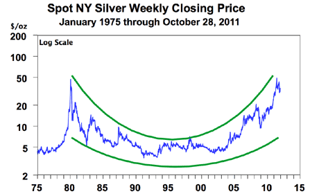
So here is the chart. It shows silver since 1975, presented on a log scale. (A logarithmic chart scales percentage moves, ie a move between $10 and $20 looks the same as a move between $20 and $40, or a move between $40 and $80.)
When considering this chart, I’m going to ignore the huge bullish fundamental case for silver. The monetary factor; the increasing industrial usage; the shortage of new mining supply; the impossibly large short position on the futures exchanges which will one day lead to the mother of all short squeezes.
I’m just going to look at the technicals.
For all silver’s volatility, it is actually an extremely symmetrical metal when you take a step back and look at the longer term. I see forming here a massive ‘cup and handle’. The cup is outlined by the two green lines, with the rims of the cup at $50 – the high reached in 1980 and earlier this year. The handle is now starting to take shape on the right hand side of the cup’s rims. It probably needs another year or more to complete.
A ‘cup and handle’ is a ‘bullish continuation pattern’ – a run up to a level of resistance (in this case $50) followed by a period of consolidation just below that level of resistance, followed by a breakout to new highs. The eventual target of the breakout should be something like the same distance from the bottom of the cup to the top. What is so compelling is the sheer scale – over 30 years – of the formation.
Silver’s low was $4, the high $50. An arithmetic chart would therefore target a high of just below $100. But this is a log chart. From $4 to $50 is a 1,250% move. A 1,250% move from the $50 breakout point gives us a target – many years away, of course – of $625 per ounce. I try not to use exclamation marks when I write, but in this case I have to – $625!
Why you should steadily buy silver
I emailed James to ask him what he liked so much about the chart. He sees the same pattern as me. He said, “It’s technically perfect”.
Summarising the rest of his email, he says: “The sell-off after the 1980 peak went to historic lows in real terms as well as in terms of the ratio between silver and gold. Even though it has been rising steadily since the 1990s, there is still negative sentiment in the form of apathy, fear and neglect – this is still stage one sentiment.” (By that he means those negative feelings are not common in a bull market that is more mature).
“The pattern is huge not just in terms of the 90% collapse from the 1980 high but also in terms of duration. It is a massive cup formation, but there is no handle. Everything there is part of the cup (ie the accumulation pattern). I think I first drew this chart over ten years ago in my newsletter, and I have been watching it form ever since. It is a classic textbook case. Then of course you have the positive fundamentals too.”
Regular readers will know that I own silver, but I have been cynical about the metal. It always shows promise, but never delivers. However, I have been extremely impressed by the recent strength silver has shown in the face of European meltdown. It briefly went to $26, outside of US trading hours, and has otherwise held firm about $30. It’s now at $34. In other years it might have fallen by a lot more.
So I have been accumulating more. But I am not in any rush. This is a multi-year pattern, and we do not yet have the handle of the cup. For it to form, silver must trade in a range for another year or so between $30 (maybe $26) and $50. A significant move out of that range would invalidate the handle formation.
Take advantage of pullbacks to accumulate more. And when it eventually breaks out above $50, who knows, the sky’s the limit. It may once again, just as it did in 1980, take a mere 1,000 ounces of silver to buy the average UK house.
Category: Market updates